Data Exploration
Abstract: This project explores patterns and causes of flight delays in the United States using multiple government and open data sources. The primary goal is to examine how flight delay trends have changed from pre-COVID (2019) through post-COVID years (2022–2024), with a focus on specific airports and airlines. The analysis compares airport and airline specific performance, seasonal delay trends, and contributing factors such as weather and air-traffic volume.
Data Acquisition
Data Collection: In order to collect our data for flight delay information, we used information from the Bureau of Transportation Statistics (BTS). The data is directly from the government and monitors flight data for all years back to 1987. Much of the data is aggregated by year or month which is good for data exploration and summary, but may not be useful for predicting future flight delays. Thus we used the Detailed Statistics Departure which can generate specific flight data for a given set of days. The tool can take up to 31 days of input for a given year, departure airport and airline. It then outputs all the flights giving their takeoff, departure time, and any possible delays. The data also give the reason for any delay and the time lost due to the delay. As a result this dataset gave almost all answers to our research questions. It lets us analyze delay reasons, and we can make predictions using information such as takeoff time, departure airport, destination airport, airline company, and other factors covered in our research questions. For now we did not have to aggregate any other data sources. However we did have to aggregate the data from the tool using multiple queries. Since the tool can only give results for certain days for a certain airline and airport we varied these factors to generate our initial data. We first chose 20 random days throughout the year covering different months and different weekdays to capture a variety of flight data based on different traffic patterns. .
Data Source & Descriptions: Several data sources were evaluated for this project, each offering unique strengths and limitations. The FAA Operations & Performance Data provides comprehensive historical traffic counts and delay statistics, making it a reliable source for analyzing U.S. air traffic performance, though access may require a Login.gov account and could be impacted by federal transitions. The Operations Network (OPSNET) serves as the FAA’s official database for air traffic operations since 1990, allowing for analysis of peak travel periods but lacking detail on delay causes and flight level timing. FlightAware offers real-time and historical flight data across 45 countries but was excluded due to its costly subscription requirements. The Bureau of Transportation Statistics (BTS) provides public access to detailed delay causes and trends, though it is limited by static downloads and the absence of real-time functionality. The OpenSky Network delivers global flight tracking data useful for modeling and trend analysis but focuses more on aircraft movement than airport-specific delays. The National Airspace System (NAS) Status site gives real-time insights into national disruptions affecting air traffic, yet it lacks historical or flight-level data. Lastly, FlightLabs provides an API for real-time flight information specific to airports like Denver International, but much of its data overlaps with other, more comprehensive sources and was therefore not prioritized for this project.
Method of Collection: Data were collected using publicly available API interfaces and query tools provided by the FAA and BTS. For the BTS On-Time Performance dataset, a random sample of 24 total days (12th and 24th of each month in 2024) was selected to capture both peak travel days and regular operations. The dataset includes flight data collected from four airports selected to represent a range of sizes and geographic regions. These airports are LaGuardia (LGA), a large and high-density urban airport; Denver International (DEN), a major national hub; Kansas City International (MCI), a mid-sized regional airport; and Chicago O’Hare (ORD), one of the nation’s largest and busiest hubs. Additionally, nine major airlines such as American, Delta, Southwest, United, JetBlue, Spirit, Frontier, SkyWest, and Alaska were used in this process. For each airport and airline combination, flight-level data were retrieved through the BTS query interface and exported as CSVs.
Relevance to Research Questions: The datasets selected for this project are relevant to the research questions because they capture the multiple dimensions of flight delays that influence air travel performance. The FAA’s Operations & Performance Data and Aviation System Performance Metrics (ASPM) provide historical and real-time statistics on flight operations and delay patterns, making them essential for analyzing national trends and assessing how delays have evolved since the COVID-19 pandemic. The FAA Operations Network (OPSNET) complements this by offering daily airport-level data, which supports temporal and seasonal analyses such as whether peak travel periods or higher traffic volumes contribute to increased delays. FlightAware adds a valuable layer of real-time operational data sourced from global air-navigation providers, allowing for cross-validation of FAA records and potential incorporation into short-term delay prediction efforts. The Bureau of Transportation Statistics (BTS) dataset serves as the project’s foundation for flight-specific delay analysis, offering detailed records on delay causes, airline performance, and airport variation. The OpenSky Network expands this scope by providing high-frequency, real-time flight-tracking data that can inform predictive modeling and spatial analysis of flight movements. Finally, the National Airspace System (NAS) Status dashboard contributes contextual insight into system-wide events such as facility outages or operational disruptions. Collectively, these datasets align closely with the project’s objectives to measure post-COVID delay trends, identify major contributing factors such as staffing, weather, or traffic volume, and evaluate the reliability and accuracy of current delay-prediction systems.
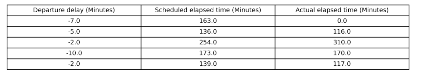
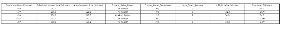
Before cleaning, the raw dataset contained only a few key flight metrics like departure delay, scheduled elapsed time, and actual elapsed time. The structure was minimal, and several records had incomplete or zero values. At this stage, the data primarily reflected timing differences without context for the underlying causes of delays or the performance of different flights. After cleaning and transformation, the dataset was enriched with additional computed and categorical features, including Primary Delay Reason, Primary Delay Percentage, Number of Delay Reasons, In-Flight Delay, and Total Delay. These new fields standardized delay categories and quantified their contribution to total delay times, enabling more robust descriptive and comparative analyses across flights and airlines.
Data Cleaning and Preprocessing
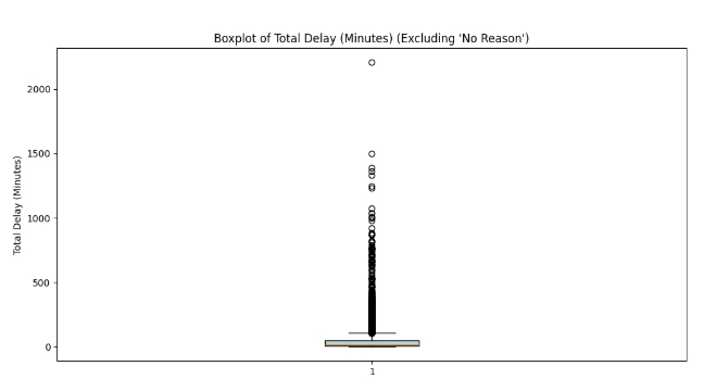
Handling Issues and Noise in the Data: Since the data was from the government and generated through a custom tool there wasn’t much missing or incorrect data that we could identify. However there was a slight issue with how total delay times were presented. The dataset only presented departure delay and would not give direct information for in flight delay. Instead for in flight information it would simply give expected time elapsed and actual time elapsed for the journey. Thus we would often see delayed flights that would have a 0 in the departure delay column. To fix this we added a new column for In flight delay that took the difference between expected and actual elapsed times. Here we ran into some missing data as some of the elapsed time columns were 0. This may indicate that the flight was cancelled or data was entered incorrectly. To fix this we simply set the In-flight delay column to 0. Total delay was then computed by adding In flight delay and departure delay.For outliers, we generated a box plot for the merged 34 datasets. According to the boxplot most of the delay times can be classified as outliers. However, it doesn’t make sense to exclude so much data since in real life long flight delays can happen, and have a large effect on both companies and consumers. Thus we only excluded delay times above 1000 minutes for delay analysis.
In addition to modifying values we also modified columns in order to better communicate flight delay information. First the flight number and tail number columns were dropped as they provided unnecessary information. Next we looked to clearly communicate the flight delay information. The dataset has 5 numerical columns for each type of delay. For each entry the column is filled with the value in minutes that the particular delay was responsible for. This makes it hard to analyze the reasons for delay immediately and we have to check all values for zeros to see if no delay occurred. Thus three new columns were added to the dataset. A primary delay reason categorical column described the delay reason that caused the largest percent of the total delay. If no delay occurred the column says no reason. Additionally, a column for the total number of delay reasons, and primary reason delay percentage were also added. As mentioned above some of the delays were due to In flight reasons that weren’t described by the data. So for these we simply put “Unknown Reason” as the primary delay reason. This can help us easily do analysis for delay reasons and answer questions such as does weather cause more delays during winter months.
The categorical data such as destination airport, airline carrier and even textual data like dates can be left untouched. It is possible that some other numerical attributes such as departure and arrival time could be modified to be categorical with morning, night and day to help model understanding, but for now we left it numerical. Computing basic statistical analysis for the delay time column did reveal some more cleaning that had to be done. First we noticed that analyzing delayed flights gave a minimum delay time below zero. This is because the dataset does not account for arrival delay. So some flights with zero or negative departure delay can still be delayed overall. To resolve this we added an arrival delay column and then a total delay column which added these two results.
Understanding the Data: Two primary datasets from the Bureau of Transportation Statistics (BTS) were used for this analysis. The first dataset consists of monthly aggregated flight delay data for airports of varying sizes like large (LaGuardia, LGA), medium (Denver International, DEN), and small (Kansas City International, MCI). These datasets span three time periods from 2019 (pre-COVID), 2022 (post-COVID recovery), and 2024 (current). A total of nine datasets were compiled, available below. A column definitions spreadsheet is also available below.
A preliminary analysis of this aggregated data revealed that flight delays were slightly higher in 2022 across all airports, likely reflecting post-pandemic operational challenges. The dataset is well-suited for cross-company and cross-year comparisons, as it is aggregated by month and includes reasons for delays. However, its aggregation limits more granular analyses, such as day-of-week or time-of-day delay patterns, and it cannot be used directly for predictive modeling. To supplement this, an individual flight-level BTS dataset was collected from the On-Time Performance database. This dataset provides detailed records of individual flights and delay causes, offering greater flexibility for exploratory analysis and modeling. Data were collected for four airports (LGA, DEN, MCI, and ORD) and nine airlines (American, Delta, Southwest, United, JetBlue, Spirit, Frontier, SkyWest, and Alaska). A random sampling strategy was used, selecting the 12th and 24th days of each month in 2024 to capture both regular and peak travel periods. The final dataset includes 24 total days per airline and airport combination, providing balanced representation across the calendar year. Some missing airline data were noted for smaller airports. The cleaned and merged datasets are available below. Together, these datasets form a comprehensive foundation for comparing airport operations and airline performance while allowing both macro- and micro-level analyses of flight delays.
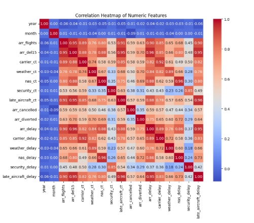
Basic Statistical Analysis: Correlation analysis revealed strong positive relationships between multiple delay-related variables, confirming internal consistency within the dataset. As shown in the correlation matrix, arrival delay, carrier delay, NAS delay, and late aircraft delay are all highly correlated (r > 0.85), indicating that disruptions in one delay category often coincide with others. This pattern suggests that flight delays tend to be multi-causal, with factors such as weather, air traffic management, and carrier logistics interacting rather than acting independently. The heatmap also shows weaker or no correlation between temporal variables (e.g., month, year) and operational delay metrics, implying that external conditions or airport-specific characteristics have a greater influence on performance than seasonal timing alone.
Comparing average arrival delay by year and airport, Denver (DEN) and LaGuardia (LGA) consistently exhibited higher total delay durations than Kansas City (MCI). The most significant spike occurred in 2022, where both major airports experienced noticeable increases in mean delay times, likely due to post-pandemic operational recovery challenges such as staffing shortages and increased passenger volume. By 2024, delays showed signs of improvement and partial stabilization. Together, these patterns demonstrate that while national flight operations have become more stable, high-traffic airports continue to experience larger and more variable delays.
Overall, the basic statistical analysis confirms that the dataset is both robust and suitable for deeper exploration into flight delay trends. The data exhibit high internal consistency, with strong correlations among related delay variables such as arrival, carrier, and late aircraft delays, reinforcing the accuracy of the reporting structure.
Data Quality Assessment: The data retrieved from the BTS service is highly consistent and complete at a small scale, but with one notable exception. The dataset used here is almost entirely empty between the times of 11pm and 5am across all airports and years. This is not due to a failure in data collection; rather, flights are not scheduled to depart at these times to avoid undue noise at night, as well as to offer a sort of "reset" to the airport overnight. Interestingly, this lack of data is itself consistent and accurately depicts the state of flights at these times. For this reason, this aspect of the dataset is not considered important to the questions of completeness, consistency, or usability. A potentially large problem with the acquired data is the question of whether it is complete. Unfortunately, there seems to be no way of telling whether any flights have not been recorded and placed into the BTS repository. There could be patterns that these missing data would reveal, such as whether observations of certain airlines are frequently missing, incomplete, or otherwise unreliable. Despite this, the BTS dataset offers a wide array of information in a niche where datasets are otherwise difficult to come by. Thus, the question of completeness of the dataset is indeterminate. Outside of this concern, the consistency and usability of the dataset rank highly.
This dataset aligns nearly perfectly with the interests and questions of this project. The source of the dataset, the BTS, is a reliable government resource which can be trusted, especially compared to any other source, to provide raw data on the subject. The only limitation of this dataset, which is quite specific to this project, is the lack of details on the causes of delays. In some cases, strong inferences must be made to determine the influences that multiple delay-causing events may have on each delay time. However, this limitation must be accepted as there are no better sources available for this research topic. In the future, additional dataset of relatively limited veracity may be integrated in some capacity to offer more insights into delay causes, such as reports from airports on employee counts during high-traffic times. One final consideration for this dataset is the minor ethical implication present. The data solely cover individual airplane flights, meaning no individuals are directly revealed. These data could potentially be used to locate specific flights based on departure airports and times, but this exercise could be undertaken regardless of the efforts of this project. Instead, the results found here and in future work in this project will largely reduce the granularity of the dataset, further improving the privacy inherent in the original data.
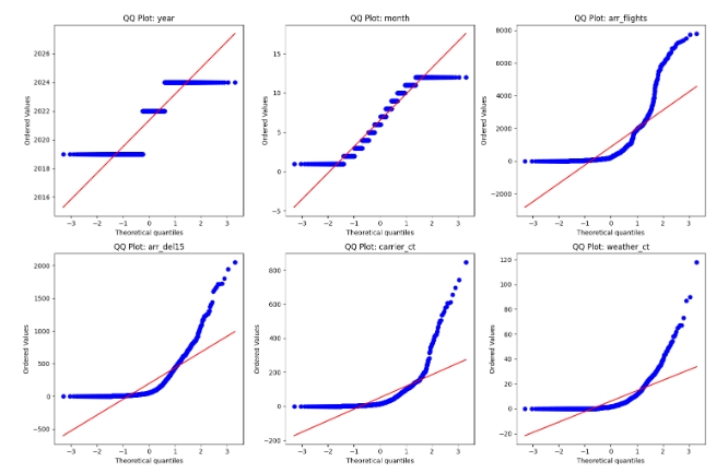
Advanced Data Understanding: This stage focuses on exploring and refining the combined dataset to ensure it is ready for modeling. It includes performing visual diagnostics such as QQ plots to assess normality, examining correlations and relationships between variables, consolidating datasets where appropriate, and applying normalization or transformation techniques to prepare the data for further analysis.
The QQ plots show that most numerical variables deviate noticeably from the red reference line, confirming that they are not normally distributed. The discrete variables, such as year and month, are naturally non-normal, while continuous operational metrics like arr_flights, arr_del15, carrier_ct, and weather_ct display strong right skew. This indicates that a few months had exceptionally high values compared to the majority. To address this skewness and improve statistical assumptions for modeling, transformations such as logarithmic or Box-Cox may be applied to stabilize variance and approximate normality.
The correlation heatmap reveals strong relationships among several variables, indicating patterns and possible redundancy. Features such as arr_delay, arr_del15, and arr_flights are highly correlated (r ≈ 0.95), showing that greater flight volumes correspond to more delays. Late_aircraft_ct and late_aircraft_delay are almost perfectly correlated (r ≈ 0.96), while carrier_ct and carrier_delay are also closely linked (r ≈ 0.92). Weather-related variables show moderate correlations (r ≈ 0.65–0.75), whereas security-related factors are largely independent. These strong interdependencies suggest potential multicollinearity, which should be mitigated by consolidating redundant variables or applying dimensionality reduction methods like PCA.
Visualization & Summaries
.jpeg)
Description: This bar chart compares the percentage of delayed flights across nine major U.S. airlines using a 20-day flight sample from four airports (ORD, MCI, DEN, and LGA) in 2024. The results show that American Airlines (28.5%), Frontier (28.4%), and JetBlue (27.7%) have the highest proportion of delayed flights, while SkyWest (18.5%), Delta (19.7%), and United (19.8%) perform better with fewer delays. This visualization suggests that airline company characteristics such as operational scale, route networks, and scheduling practices may influence delay frequency, making carrier type an important variable in predictive delay analysis.
.jpeg)
Description: This series of pie charts illustrates the distribution of flight delay causes across major U.S. airlines, based on a 2024 dataset combining flights from four airports (ORD, MCI, DEN, and LGA). There is a large percentage of unknown delays and these may be hard to model since they can’t be predicted and usually happen in flight. Outside of this across all carriers, the most frequent causes of delay are late-arriving aircraft, carrier-related issues, and National Airspace System (NAS) factors, with weather and security delays representing a much smaller share. Although proportions vary slightly by airline, a consistent pattern emerges. These findings suggest that operational and scheduling factors internal to airlines have a stronger influence on delays than external causes like weather.
.jpeg)
Description: This violin plot displays the spread and distribution of departure delays across major airlines for delayed flights only. Most airlines show a right-skewed distribution, meaning a small number of flights experience very long delays while the majority are clustered under 100 minutes. JetBlue and American Airlines display heavier tails, suggesting greater variability and more extreme delay instances. By contrast, Southwest and Alaska Airlines show narrower, more consistent delay ranges.
.jpeg)
Description: The bar chart compares the average departure delay time (in minutes) for each airline. Most carriers maintain averages between 60 and 70 minutes, but American Airlines stands out with the longest mean delay (73 minutes) , while Alaska and Southwest show the shortest averages (40–45 minutes). The smaller variance observed for these two carriers may reflect more efficient operations or fewer long-haul delays. Together with the violin plot, this visualization confirms that while average delay times appear similar across airlines, the distribution shape and frequency of extreme delays vary significantly.
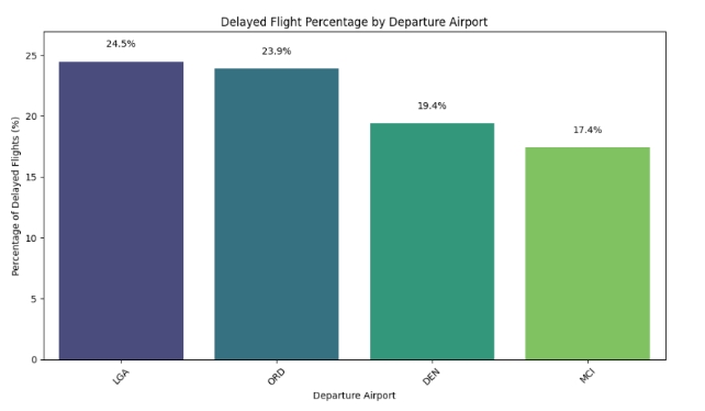
Description: This bar chart compares the percentage of delayed flights across four major departure airports, LaGuardia (LGA), Chicago O’Hare (ORD), Denver International (DEN), and Kansas City International (MCI). The results show that LGA (24.5%) and ORD (23.9%) experience higher delay rates than DEN (19.4%) and MCI (17.4%). This pattern aligns with expectations, as LGA and ORD are high-traffic hub airports with greater congestion and tighter runway schedules, leading to more frequent operational delays.
.jpeg)
Description: The first bar chart compares the average departure delay times among four major airports, Chicago O’Hare (ORD), LaGuardia (LGA), Kansas City (MCI), and Denver (DEN) for delayed flights only. ORD shows the highest average delay at around 70 minutes, while DEN records the lowest average at roughly 55 minutes. The accompanying violin plot visualizes the distribution of delay durations across the same airports. All distributions are right-skewed, with most flights delayed under 100 minutes but a few extreme outliers exceeding 800 minutes. The similarity of these shapes suggests that while average delays differ slightly by airport, the overall delay behavior follows the same pattern of frequent minor delays with occasional severe disruptions.
 (image 7).jpeg)
Description: See Above.
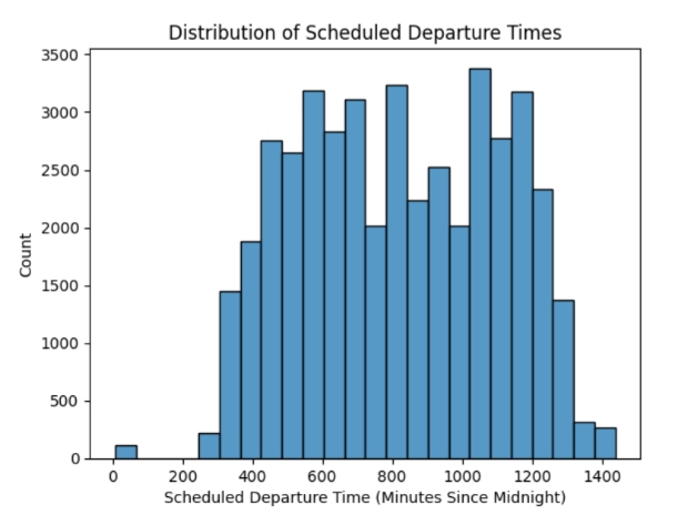
Description: This histogram illustrates the distribution of scheduled flight departure times throughout the day, measured in minutes since midnight. The chart reveals a clear gap in flight activity between roughly 11:00 p.m. and 5:00 a.m., reflecting the nationwide curfews implemented at most airports to reduce overnight noise and allow time for maintenance and operational resets. Apart from this period, flight frequency increases steadily through the morning and peaks during midday to early evening hours (approximately 600–1100 minutes, or 10 a.m. to 6 p.m.), aligning with typical passenger demand patterns. This visualization confirms that most flights are scheduled during normal waking and business hours, offering useful context for understanding when delays are most likely to occur.
.jpeg)
Description: This scatterplot visualizes the relationship between scheduled departure times (in minutes since midnight) and corresponding departure delay durations. The majority of data points cluster near or below zero, indicating that most flights depart on time or with minimal delay. Delay density mirrors the daily scheduling pattern observed in the previous histogram, with flights concentrated during midday and evening hours. A slight increase in longer delays can be observed among flights departing around 1,200 minutes after midnight (approximately 8:00 p.m.), suggesting that evening flights may face compounding operational delays from earlier in the day. However, this effect is modest and does not represent a strong or consistent trend. Overall, the visualization confirms that while delays are slightly more common in the evening, flight performance remains generally consistent across the day.
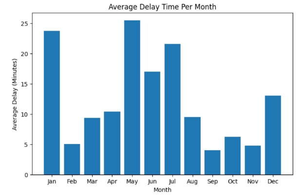
Description: This bar chart illustrates the average flight delay duration by month, revealing clear seasonal patterns. Delays peak during the summer months of May, June, and July, likely due to increased travel demand during the vacation season, leading to heavier air traffic and tighter scheduling. A secondary surge occurs during the winter months of December and January, which corresponds with the holiday travel period when flight volumes rise sharply over short time spans. These two peaks align closely with major U.S. travel seasons, suggesting that demand-related congest ion and weather factors jointly drive longer average delays. The visualization reinforces that temporal patterns are an important contextual variable to consider when modeling or predicting flight delays.
These insights guided our data preprocessing, normalization, and variable selection steps before moving to the modeling phase.